i n t e r i o r s u p e r i o r
We've been a bit quiet around these parts since the first of the year-- mainly due to the extraordinarily time-consuming process of relocating that seems to drag on quite literally forever. Thank you for sticking around with us, though, and we'll be posting new content daily again starting this month!
We have many new features on the way. Speaking of, are you an artist? If so, please contact us at ta@tamer-animals.com to be highlighted on a new feature we will have coming up soon!
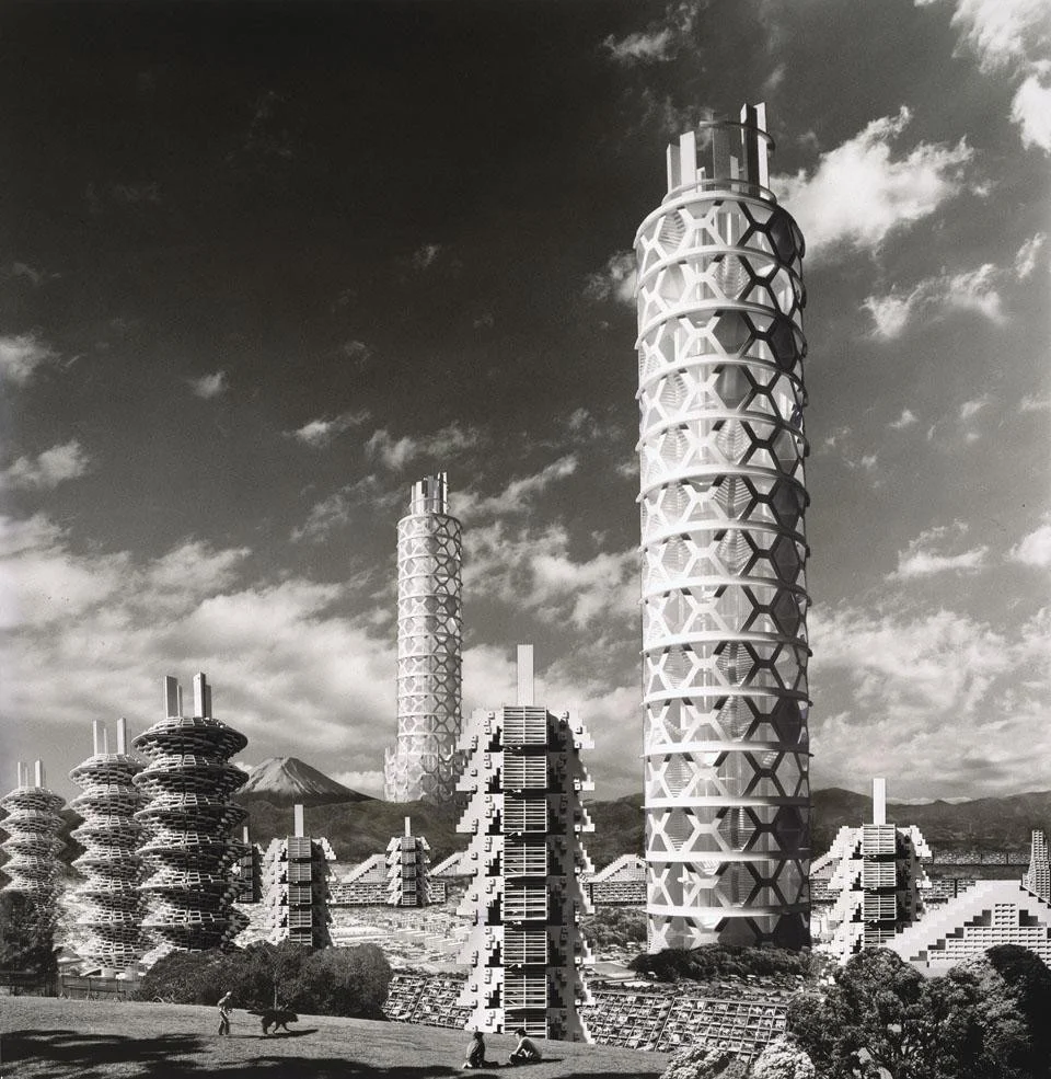
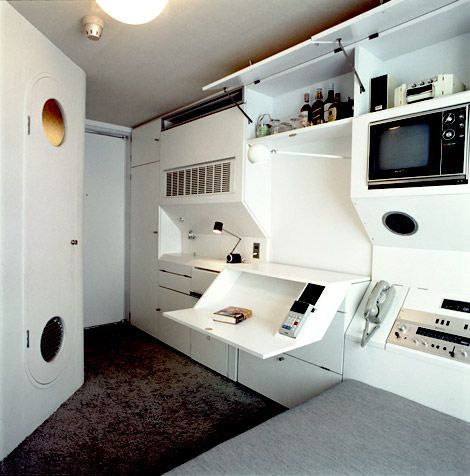
Here are some fresh looks that are inspiring our home renovation right now. Happy Saturday, folks! :)

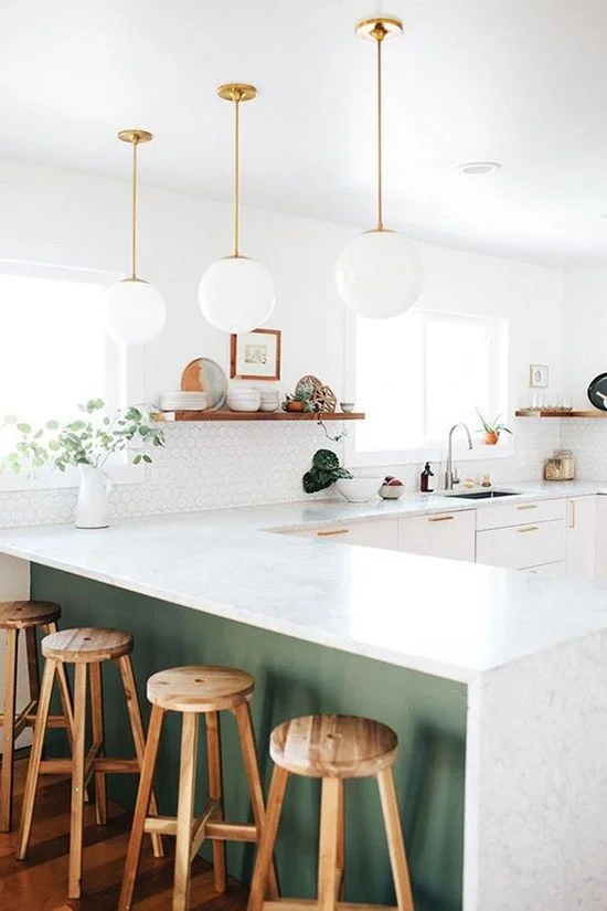
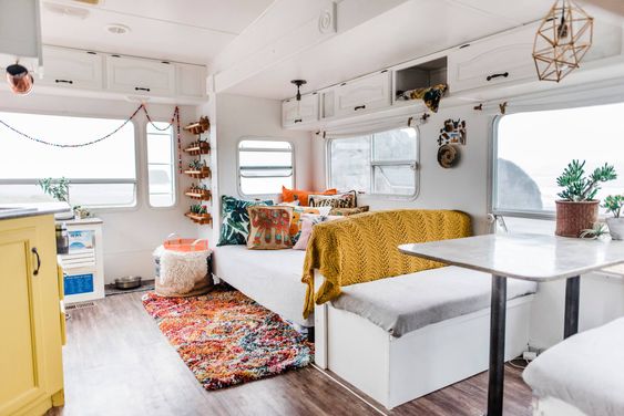
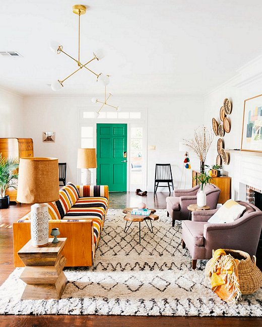
(.) Light, natural tones, and pops of color can really work wonders to enhance a space.

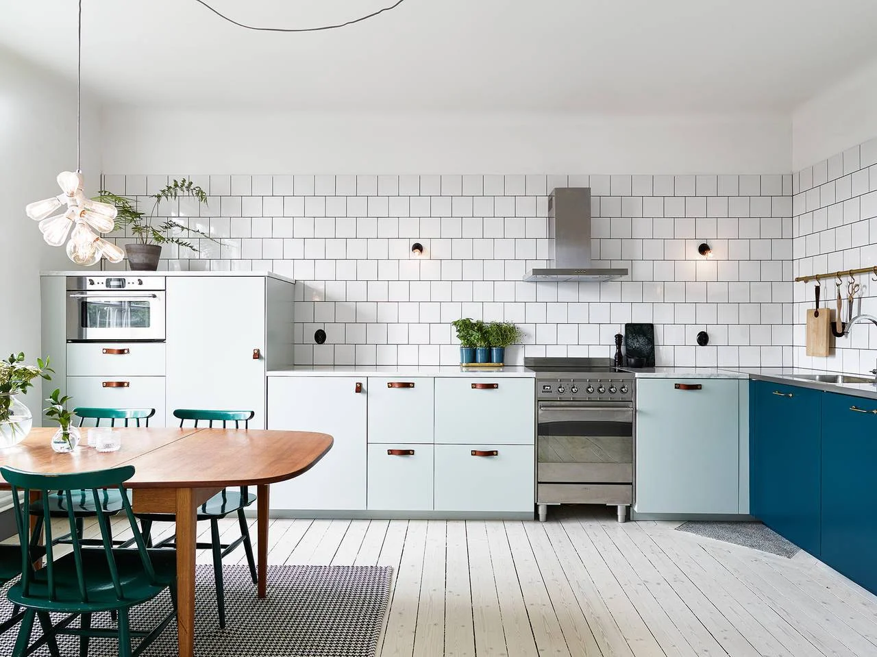
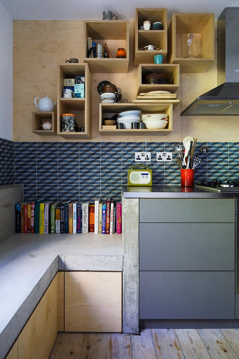
(.) Graphic tile can add dimension to a kitchen or bathroom.
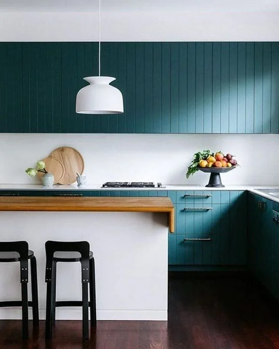
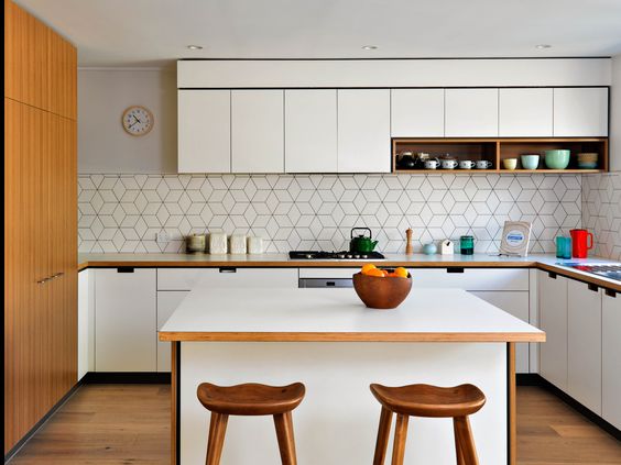
(.) Less is more! This minimal kitchen uses color to add wonderful visual contrast.
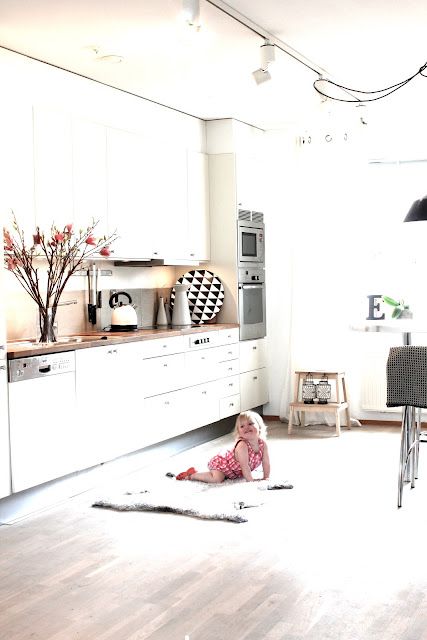
(.) Wide open space can be useful for a variety of activities-- not just cooking!

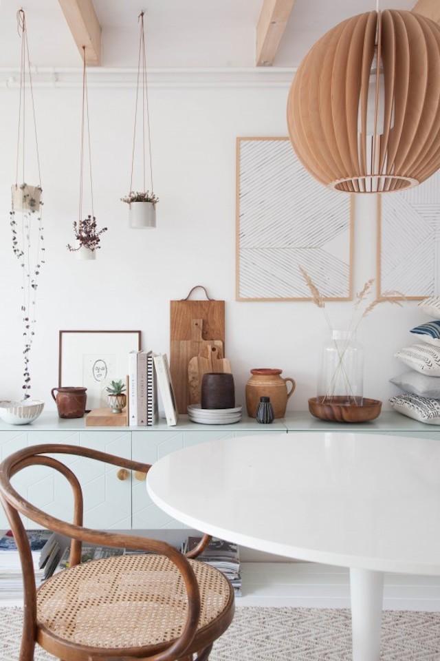
(.) Furniture pieces with low, clean lines can create directionality and visual harmony.

(.) A clean and compact workspace can ease distractions while promoting productivity.

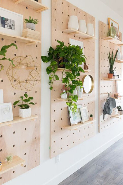
(.) Bringing the outdoors in can be calming and add some visual interest to your cleansing rituals.

(.) Cozy bedding and green plants can compliment a space well. Some plants can even help with replenishing oxygen in the home or with filtering out negative odors.
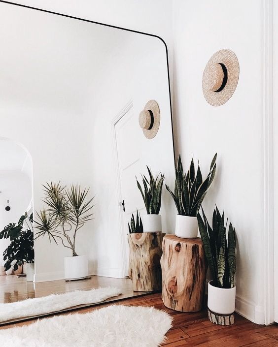
(.) Big mirrors can add dimension to a space and make it seem larger than life!

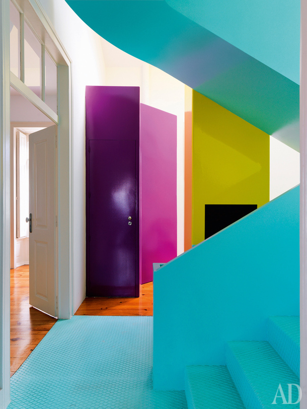
(.) We just love the gray flooring with the pops of color. The adaptive reuse of the fireplace is a nice touch, too!


