|   tamer animals    |

handmade | illustrated | found | curated design

design therapy: free tamer animals "n a t i v e" photoshop CC actions pack

Taylor A.Comment

We've been working on several sets of photoshop actions to release in the upcoming months and decided to go ahead and release a free pack of actions chosen from each set for you to enjoy and play around with. The

"

native pack

" includes the following actions:

holiday, camino, folkway, honeycomb, posey, + hornsby

. These actions were made with Adobe Photoshop CC and we're currently working on making them more Lightroom friendly for you LR users out there. 

To use them, simply download them by clicking

here

and following the download instructions. Be sure to download them into your Photoshop "Actions" folder on your computer so it can find them. Once you have done that, open Photoshop, click on your Actions tab, and right click on the little pull-down menu on the right-hand side of it. From there you should be able to load the action set and just press the "play" button on the one you want to use. Keep in mind that each action will do different things depending on the colors and style of the original photo, so if you don't like something in a particular step, just uncheck it before you press "play."  If you don't know much about actions,

Photoshop Essentials has a fabulous set of tutorials

 on everything actions. 

Please let us know what you think and feel free to contact us if you have trouble getting it to load so we can walk you through it. Feel free to show us your results, if you like! We'd love to see what you come up with! Thanks and happy editing!

-

your pals at TA

"holiday"

has a red-aqua washed-out tone and is good for pictures of life moments, food, and action shots. 

"camino"

 has a blue-green-yellow base and gives a summery, southwestern vibe to your photos where the colors really pop!

"

folkway

" is desaturated with colorful, crisp undertones. It was inspired by Nashville and country music. It works well with music photos, macro shots of goods, and portraits. 

"honeycomb"

gives you that over-processed, subdued technicolor 1960's postcard look. It works best on architecture, wilderness, and travel photos.

"

posey

" is a yellow-orange-blue toned grainy action. It is great for wildflowers, fields, macro shots, and vintage-inspired photo shoots with in the natural world.

"

hornsby

" is a blue-orange tinted grayscale with a soft contrast and  high film  grain. It works like a champ with classic-style photos and artistic shots. 

Follow TA!

DAILY DRIFTER: the feels

Ally R.Comment

On the dreariest of days, many of us feel blue. Whether it is psychological or emotional, the intensity of feelings can either make us soar over the moon with joy or want to crawl into a dark hole of sadness. Feelings are transformative. We cry at movies because we empathize, we smile when we are overjoyed, and we sulk when we are betrayed or hurt. Sometimes we even feel anger and frustration or a grief so profound that we question our own mortal coil.  The incredible mystery of feeling is overwhelming and by its very nature elusive.  The feelings generated by the cosmos are so multifaceted and fleeting that some mornings we simply just want to stay in bed and wait for the storm to pass over us. Today, we dedicate this post to "the feels."

xoxo,

Ally

"Untitled" by

rebeca rossato siqueira

"Untitled" by

malguina malguina

"a few flowers at his feet and above him the stars." by

jessica lia 

"Untitled" by

marine beccarelli

"he likes his RED beard.." by

camelot98

"after the winter" by

peter and 

dank

"Untitled" by 

joaquiën

"dolphin kid" by

arina antonova

"Untitled" by

carolina conte

"Untitled" by

A manda*

"Untitled" by

roco perna

"." by

pablo abreu

"Untitled" by

danila golavachkov

"MOTHER OF SUN" by

septa una

Follow TA!

➾b a b y l o v e➾: best nests

Maddie C.Comment

When people say we're "nesting," we're not just decorating for a new baby (or big kid, for that matter.) We're building something. We're building their imaginations, their creativity, and their love for color and texture. As our kids grow up, they will grow with the spaces they inhabit, so to give them inspiring places to play and rest will better prepare them for a bright future. Here are some amazing nests from all over the world:

(

source

)

(

source

)

(

source

)

(

source

)

(

source

)

(

source

)

(

source

)

(

source

)

(

source

)

(

source

)

🐼♥️,

Maddie

Follow TA!

b o o k f a i r : the fairest of them all

Maddie C.Comment

b o o k f a i r

we're reading:

t

he fault in our stars

by john green

#girlboss

by sophia amoruso

the vacationers: a novel

by emma straub 

t

he book of unknown americans: a novel

by cristina h

enríquez

my salinger year

by joanna rakoff

the nesting place: it doesn’t have to be perfect to be beautifu

l by myquillyn smith

design bloggers at home

by ellie 

tenant

hollow city: the second novel of miss peregrine's peculiar children

by ransom riggs

we also love:

poppytalk

diy:

wooden base desk lamp

100 years of fashion in 100 seconds (on 

vimeo 

)

light and lovely (

sfgirlbybay

)

melbourne home: lucy feagins and gordon johnson (via 

the design files

)

halcyon days:

last week at pot + pantry

the amazing way this 12-year-old girl reminded us to be grateful (as seen on

hello giggles

)

7 unique non-toxic houseplants (as seen on

abeautifulmess

)

🐼♥️,

Maddie

Follow TA!

life in the pursuit of fashion: 1960's Japan

Taylor A.Comment

maiko. (

source

)

When most of us think of "vintage" Japan, the image of a geisha usually comes to mind. I don't know if I watched "My Geisha" one too many times (

Shirley Maclaine is my spirit animal

) or what, but I always picture 1950's-70's Japan as this sort of technicolor burst of postcards of shrines and local attractions. I think of airlines, Godzilla, and probably most of the stereotypical tourist traps you would think of. But the Japanese culture is incredibly fascinating, and the lovingly kitschy quality is not lost on me. I'm very fond of Metabolist architecture, of mod fashion (they did it better, honestly), and just the genuine spirit that seemed to be in the air during the time after the war. I've always held a fascination and the deepest respect for the culture and people. Both have proved to be a great inspiration throughout my life and continue to see new life in various projects and designs I work on.  So, to fully disclose my full admiration of that nostalgia, here is a top ten list of why 60's

Japan Modern

was the best time ever for fashion design:

(

source

)

    1. They Had the Ultimate Camera Fashion

                            I can't even begin to describe to you how amazing and fun the cameras were created during this time. Not only did they have all sorts of neat gadgets, but they were colorful, usually made of plastic or a similar material, and worked as the perfect (effortless) fashion statement. Instant cool points just for rocking that powder blue Minolta. 

(

source

)

2. They Made Minimalism Colorful + Chic

While we Americans were rocking paisley sheaths, they were inventing minimalism in a new and colorful way.

(

source)

3. They Totally Knew Their Pattern-to-Solid Ratio

Even with patterns, they managed to make everything look flawless and feminine.

(

source

)

4. They Made These Incredibly Popular 

Does this even need an explanation? These suitcases RULED and still do today.

(

source

)

5. Even Into the Late 60's, They Still Broke the Mold

Even when emphasis shifted to patterns, they still made awesome clothing and played around with different structures and textures.

(

source

)

6. They Styled the World's Cutest Uniforms (and still do)

AIRLINES. When I think of 1960's stewardesses, their signature minimal mod style comes to mind. They paved the way for all other stylish industry uniforms, in my opinion. 

(

source

)

7. They Made Everything Kawaii

I'm pretty sure they even invented kittens. Everything they produced had some level of cute yet proper. 

(

source

)

8. They Made Us Want to Wear Knee Socks

I never was a huge fan of knee socks and mary janes. When I saw pictures like this, however, I wanted like twenty pairs of them. 

(

source

)

9. They Had the Best Sewing Patterns EVER

Hands down, the most beautiful shift dresses I have ever seen. Come to think of it, they invented so many neat fabrics during that time, too. 

(

source

)

10. Even Their Toys Were Better Than Ours

I'm almost thirty and I still want these. 

Follow TA!

DAILY DRIFTER: the wild ones

Ally R.Comment

"

baby if you wanna

 be 

wild you got a lot to learn.."

Bruce Springsteen

totally said it best, and today we're going to celebrate the

wild

child in all of us. Back when I was in junior high school, I thought I was some sort of riot grrl, but I still paled in comparison to most of my eccentric friends. What some consider wild, others consider tame-- so I leave you to be the judge. Here's some movers and shakers for your daily dose of awesome on a blah Monday. 

xoxo,

Ally

"Disturb, please." by

federica

"The Rose" by

giulia rossi ferini

"Untitled" by

FRNCKJSSLD

"Untitled" by

GORSAD.KIEV

"Untilted" by s

avina gost

"sht" by

akuma aizawa

"Jeune et Jolie" by

gus barletto

"Untitled" by

Søren bΛp†iŞm

"Untitled" by

bluesposnuclear

"red 6" by

william boulter

"Untitled" by

carolina conte

"De quando você foi um pôr do sol de outono" by

tuane eggers

"Untitled" by

anna laznya

"Untitled" by

lucy marti

Follow TA!

the notebook: Magazine, Nostalgia 1960's Japan, Wild Ones, Photoshop Actions, + Oblivion

Taylor A.Comment

We've all gotta start somewhere, right?

This week we're taking a trip down memory lane to celebrate where we've all been and where we're all going.

It has been really invigorating to see how much it has grown and evolved over the years, as we have all grown and evolved along with it. 

Yes, that was actually wire...you can stop laughing now. :) 

By looking at the past, we're able to examine our future in a much more informed light. By stepping away from the print publication and into the world, it gives us a new kind of freedom of expression that is not bound by cost or print deadlines. 

But we have to give the magazine some merit. It taught us a lot about what to do and what not to do, and it was fun to work on and be a part of. So we're using the magazine to serve as the baseline-- the ideology and mission still stands, but we're able to bring more of who we are to the table and less of what was expected of us. If you would like to visit our roots, you can download a free pdf copy of the first paper + wire magazine  

here

or read it (also free)

here

!

This week, we will be...

   ...looking at 1960's Japan's fashion influence and maps

                                         ...taking a walk on the wild side with Ally and the Wild Ones

                                         ....reviewing a band that has hands-down the best name ever

                                         ...seeing amazing rooms for kiddos, dynamic interiors, and fantastic parties

                                         ...discovering the feels, take a road through the ruins, and into oblivion

                                         ...find out ten reasons that we're "doing it wrong" according to Maddie

       And this Tuesday, we will be releasing a free set of Photoshop CC Actions for you to enjoy!

The best part: They're free. FREE!

Thank you so much to everyone for your support and for giving us a chance! You guys are the best!

♡,

♎︎Taylor♏︎

Follow TA!

Pinterest Roundup: stripes

Maddie C.Comment

I don't know about the rest of you, but I can never own enough things with stripes. Dresses, blouses, skirts, pillows, shoes, notebooks, pencils, etc....get my drift? Fashion was greatly transformed by stripes, and it is my personal belief that we have Coco Chanel to thank for it. 

But stripes are wonderful, and clean-looking, and they can be used in so many different ways. They make us happy by reminding us that everything is linear on some level or another, and there's of course the nostalgia of maritime style.  

So, hey! Let's take a gander at the wonderful world of stripes. 

How could we not love Jean Seberg in stripes? (

source

)

Even in nature, stripes have always been your friend. (

source

)

Daphne van den Heuvel knows what's up. (

source

)

You can wear them with solids for instant magical superpowers. (

source

)

Because sometimes stripes are just darling... (

source

)

And sometimes they're daring... (

source

)

And sometimes you can wear stripes on stripes and it doesn't look like you're on drugs.. (

source

)

And when all else fails, you can eat your ice cream with stripes.

(source

)

🐼♥️,

Maddie

Follow TA!

DAILY DRIFTER: Into the Woods

Ally R.Comment

When I think of the woods, I think of sprawling forests of old growth trees, the craggy mountains of my childhood, and long walks with no destination in particular. I've always lived in cities, so it has often been a daydream of mine to venture to parts unknown. Camping with my Dad before he passed was a particularly fond memory for me. 

What images does your mind conjure up when you think of the great outdoors? Here's some little sparks of inspiration from our flickr group. Please check out these amazing artists by clicking on their names to go to their respective pages. Thank you!

xoxo,

Ally

"I am a singing of leaves II (alternate tonality)" by

rapidheartmovement

"34A_0487" by

andi singer

"tatiana" by

michel nguie

"sequoia" by

christopher mongeau

"Untitled" by

danielle christine 

"Untitled" by

sean gilchrist

"Untitled" by

imitation o f life

"Untitled" by

david paton

"Untitled" by

jamie miller

"

Quanto silêncio cabe em um sentir?" by

tuane eggers

"untitled" by

renata ibis

"Untitled" by

fitz

Follow TA!

coffee + craft: make a coconut rhubarb latte and build your own coffee bar!

Taylor A.Comment

Hey guys! Welcome to our first

Coffee + Craft

workshop. First we're going to make a coconut rhubarb latte (don't be thrown off by the rhubarb-- it's amazing!) courtesy of Denver's barista skills. Then I'm going to walk you through the quick, easy, and cheap way to build a coffee bar in your home!

COFFEE:COCONUT RHUBARB LATTE

Rhubarb and coconut might just be a match made in heaven.

what you need:

1/2  can of coconut milk

1/2 cup of soy milk or whole milk (He says local dairy with milk fat would be preferable)

3 tsp. of rhubarb simple syrup (Denver swears by

this recipe

from Tori Avey but if you can find some locally, good!)

1/2 tsp of coconut oil

2 shots of espresso (or you can use 1/4 cup of a cold brew concentrate if you're in a jam)

1 tablespoon of wildflower honey 

A spritz of cayenne pepper

several drops of beet juice (optional, for richer color)

Small whisk or manual milk frother (if you have one on your espresso machine, even better!)

1-2 tsp of coconut flakes (as a garnish, optional)

for an ICED latte:

S1: After you have all of the ingredients gathered up, make two shots of espresso (if not using espresso, heat up the brew just barely-- this helps dissolve the syrup and honey.) 

S2: Combine espresso and simply syrup/honey. The rhubarb will usually give everything a red tint, but the simple syrup is tasty!)

S3: Add milk and coconut milk. 

S4: Stir mixture together until well blended.

S5: Pour over a cup of ice. ideally, the ice should only take up 1/3 of the cup size. If you want it to be a more dynamic red-pink rather than a muddy red-pink, add a few drops of beet juice to reach the color you desire.

S6: Garnish with coconut flakes and a light dose of cayenne pepper (optional)

for a HOT latte:

S1: After you have all of the ingredients gathered up, make two shots of espresso (if not using espresso, heat up the brew just barely-- this helps dissolve the syrup and honey.) 

S2: Meanwhile, combine both milks and heat them on a stove (or your espresso machine) on low-medium heat until it starts to ALMOST boil. 

S3: Combine espresso and simply syrup/honey. The rhubarb will usually give everything a red tint, but the simple syrup is tasty!) 

S4: Stir 90% of the milks into the espresso/syrup mixture in your mug/cup. The additional 10% can either be manually frothed with a whisk or you can add a little cold milk and use a machine frothed. 

S5: Pour frothed milk on top as a cap. Let it sit for a minute or two to cool down a bit. 

If you want it to be a more dynamic red-pink rather than a muddy red-pink, add a few drops of beet juice to reach the color you desire. 

S6: Garnish with coconut flakes and a light dose of cayenne pepper (optional)

Prep. Time:

After making simple syrup (~40 min), prep is typical less than 5 minutes. 

+

CRAFT: AWESOME COFFEE BAR 

So.....

The backstory on this is that when I was nineteen I started my first business, which was among other things, a coffee shop. That was after working as a barista at a local coffee shop for almost two years, so I really liked making coffee. I really didn't have a good prep area to make speciality drinks in our house (my coffeemaker divorced my kitchen counter long ago), so I was spending ridiculous amounts of money on drinks at local coffeehouses and Starbucks when I could have been making them at home. Then, I had the epiphany that I really needed a desk of some sort since I endure so many grueling hours rendering architecture projects on my laptop, so in the end it seemed like a pretty good idea to combine the two workspaces. Much to my boyfriend's chagrin, I drilled about 15 holes in the wall, but it's incredible to have a sturdy space to work.

The best part was that it was cheap. And it's awesome.

How cheap it is really depends on the materials you can and can't live without. I splurged on the heavy-duty mounting brackets, but cut corners on picking a more eco-friendly, yet inexpensive wood. You may want to use a more expensive wood or a different size than we did, but definitely shop around and compare prices. The actually coffee bar itself (the wood plank and the brackets/screws) only ran us roughly $15 for the wood, $18 for the heavy-duty brackets, and $4 for a box of screws. You can, however, keep building on to it and create a workstation, which is what we did. 

Gathering supplies and pre-planning. 

materials needed (what we used)

1  12"x  ~1" x 8' piece of glued plank wood (Lowe's has this and a plank-style version for around $10-20)

1 box of coarse drywall screws

2-3 heavy duty brackets (I would highly recommend 3 if you're going over 6' in length)

1 powerful drill/screwdriver

1 stud finder or good ears

3 1/4" screws (to secure the board to the brackets)

1 bottle of Howard's Cutting Block Food-safe Prep Oil/Wax (or equivalent protectant for wood)

1 roll of paper towels or sponge 

1 Tape Measure

1 Pen/Pencil to mark drill holes

1 Level

Safety Glasses

optional materials

1 12" x ~1" x 6' piece of glued plank wood

1 LED strip (ours was $40 and plugs into the wall, but there are many types in several price ranges)

1 Unfinished wood shelf (with an overhang to help block light, should you use an LED lamp- we found one at target for $8 and Ikea has a wide assortment, also)

1 unfinished wooden square box (we bought one at a hobby/craft store)

E 6000 adhesive (for metals and adhering wooden box to small plank)

Cute decor to spruce it up

The final result. 

S1:

Beginning with your measuring tape,

measure the area you are wanting to place the coffee bar at

. Ideally, there should be enough space between the wall and the bar for cords. If you would like it to be flush against the wall, make sure to cut notches/holes in the board before you attach it to the wall. 

S2:

Purchase your board. Cut your board to the desired length

(Places like Lowe's typically provide a single cut in-house, so you don't even have to trim anything if you don't want to.) We went ahead and applied 3-4 coats of the mineral oil (20 min. drying time per coat) with some paper towels and let it dry overnight. If you use varnish or polyurethane, make sure to do it in a well ventilated area and allow adequate drying time so it won't be too sticky. 

S3:

Once you have your board,

use the measuring tape to measure the appropriate height.

(if using chairs or stools at the bar, make sure a person can fit comfortably underneath it). 

S4:

Find your wall studs. The higher the pitch, the closer to the stud you are. If you don't trust your ears, a stuff finder is a handy thing to have. Once you've found your studs, place a pencil line at the appropriate height/stud location. 

S5:

Now you'll want to mount the first bracket. In a perfect world, you would be able to fit three brackets equidistantly so that the load is distributed properly, but it is really dependent on the length of your board and location of the studs (they should be spaced at the same intervals unless it is an older house.) Use your best judgment. If you can only use two brackets, try to get them as evenly spaced as possible to prevent the wood from bowing. The brackets can hold up to 500 lbs each-- the wood is not so fortunate, although it can withstand quite a bit, too. Place a tick mark on the wall where each screw hole is. These will be your guide to prime the wall space.

S6:

 Take your drill and, using a drywall screw as a guide (or a small drill bit),

create holes where the tick marks were that you just made. 

S7:

Now

proceed to mount the bracket to the wall

. I would recommend screwing the top hole in first, then the bottom, and then the middle (if applicable.) Follow S5-S7 for the second bracket, third, etc. 

S8:  Once you place your board,

use a level to verify that everything is straight

. If it isn't, you'll have to go through the process of remounting it again, which will leave more holes to fill! 

S9:

 Once the wood is securely in place,

take the 1/4" screws and screw them in to the top hole in the bracket to help secure the board

S10:

And voila!

You're done!

Go make some coffee!

S11:  

If you want to go the optional route

       S11A: Prime all of the wood. 

       S11B: After that dries, affix the square wooden box to it with a healthy amount of E6000 glue.

       S11C: While that is drying, take the wooden shelf and glue the LED fixture to it with E6000. Make sure to not glue any parts that you may need to remove. We ended up using a scrap piece of wood to make a longer light shield, so if you need one, glue that on, too. Let this sit overnight.

       S11D: Then, take more drywall screws, find the studs, and screw directly into the studs until it is snug against the wall. 

       S11E: Decorate! 

The optional workspace component. 

We hope you enjoyed the first edition of

coffee + craft

. If you have any questions or are stumped on something in the instructions, feel free to leave a comment and we'll walk you through it! Thanks, guys! Happy brewing!

-Denver + Taylor

Follow TA!

DAILY DRIFTER: Minimal Surrealism

Ally R.Comment

Mirages in the Sahara. Solid-voids. Cemeteries and canals. 

Get it? I'm being ironically minimal. 

All kidding aside, the following are some gorgeous examples of minimal surrealism in form. 

These are some profound ways to express minimalism and surrealism combined. Sometimes they are haunting, eluding, and intoxicating. Oftentimes they are pure magic. 

xoxo,

Ally

"cementerio nueva esperanza. Lima - Perú" by

javier castro

"Klemence" by

lucile perron

"homesick" by

giuliana massaro

"Anna" by

sergey filimonov

"push the sky away" by 

Mariana Cecílio

"The loss of the purity" by

dara scully

"Untitled" by

posidonia...

"Untitled" by

heitor magno

"Untitled" by

ChihHsien Chen

"Untitled" by

alexandra moskow

"Untitled [Mama] 2014" by

george nebieridze

"_23_0988" by

Ioana Lupascu

Follow TA!

Ear to the Ground: Listen to Wishyunu’s Futuray

Denver B.Comment

Bei Yan and Tony Bertaccin of 

Wishyunu

Wishyunu is a drum and synth duo hailing from Portland, OR. With beautifully melodic electro-pop music and haunting vocals, spouses Bei Yan and Tony Bertaccini have an incredible musical synergy that gives the songs an interstitial quality, allowing you to feel as if you are standing on the precipice of a void. The tracks are dreamy yet continuously solid and with the aid of recording extraordinaire Jeremy Sherrer, the collaboration is an album full of ample talent and intrigue.

Although this 4-track EP was released in 2013, it is one of those that constantly finds its way back into my tape deck. I especially love the tracks “Sprayy” and  “Neutron” but all of them are amazing. Their earlier work was equally wonderful, but I have to say, so far this album is stellar. I, for one, look forward to seeing what the next album brings us. 

To hear more of their work, check out their bandcamp site (

http://wishyunu.bandcamp.com

). The album is also available on iTunes and they have Facebook, Twitter, and everything else so there's really no excuse if you miss this gem. 

-Denver

Follow TA!

Future Primitive: Why Thigh Gaps, Nosetraps, and Numbers Are So Overrated

Maddie C.Comment

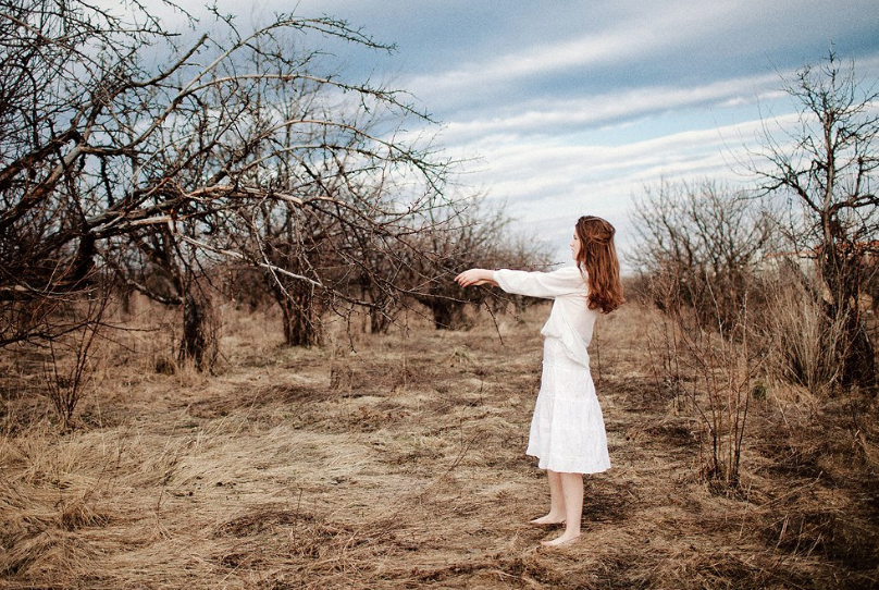
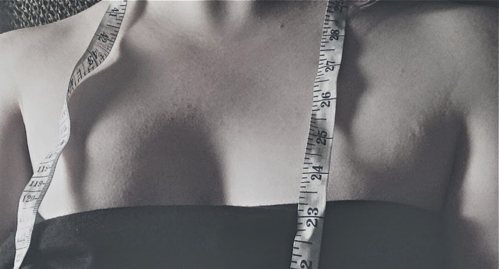
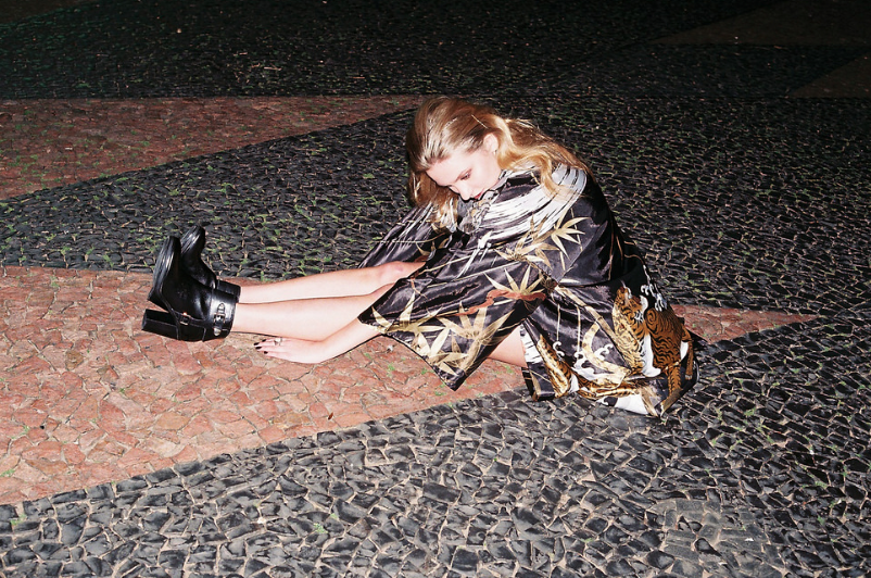
"Love is NOT  a dress size." Image sourced via TA. 

“Hey Mom! Mom! Hey Mom! Mom!....”

“Yes?”

I peered over the rim of my glasses at my daughter, to see her standing in a cute floral sundress we’d purchased for her recently.

“...Do I look fat in this?”

She placed a hand on her hip, looking up at me with earnest worry on her fragile face.

I didn’t really know how to respond. I was kind of blown away, to be honest.

I cringed

because an eight year old shouldn’t be worrying about being fat (She’s not, by the way. At all. Nor should she be. She’s EIGHT.)

I cringed

because I had just asked my husband, Clark, this same question a few nights ago about my dress when we were getting ready to go to her recital. I’m not sure where this preoccupation with body image started, or why it is a necessary evil for us to have fulfilling lives, but it stinks. While there are studies about obesity in children and it has definitely made the news, so I'm not discounting the realities of that, my kid literally looks like a twig. I can't even begin to fathom how a kid her age has 

already

 been brainwashed into thinking she is a failure somehow, yet here I am, "failing" her for the same reason by not setting a better example. 

Love is NOT a dress size.

Your value should not be based on a number or letter tag on a piece of clothing. Your value should also not be influenced by near-anorexic models or photoshopped celebrities. Your value should be based in who you are and what good you bring to the world. That’s not saying that we all don’t have days that we feel ugly or not ourselves. I’m not against wearing makeup or trying to look nice, but my eight-year-old daughter asking me this really woke me up to the example I set for her, by being just as preoccupied with image as society deems us necessary to be. 

That being said, I don’t completely blame myself. It doesn’t take a genius to realize that even the magazines geared towards kids focus on many of the same issues we deal with as adults, only a bit more sugarcoated (sometimes.) We are bombarded with media  since we leave the womb that compels us to buy things, to look a certain way, and to behave in “acceptable” ways. We are constantly competing with society's ideal of perfection rather than instilling in our children the realities and beauties of imperfection (as true perfection, if that makes any sense.) The constant state of dissatisfaction is alarming. Camille opened my eyes to the fact that, if I can’t be comfortable in my own skin, how can I instill a positive body image in my kids?

I have cellulite. I wear a dress size waaaay larger than I ever would have imagined wearing in my twenties. After having two kids and gaining 40+ pounds during each pregnancy, I’m nowhere near the size 0-2 I once was. I’m reaching that age where the idea of going for a run is the equivalent of doing math in junior high school (Definitely not a math whiz.) I have fat in areas I never even knew existed until I gained weight.  I can’t even begin to comprehend how to look at a nosetrap, but I probably would fail that, too. These are all facts.

What is also a fact is that these facts are irrelevant.

My husband loves me at 160 lbs as much as he loved me at 120. My family and friends don’t even notice the weight like I do, or feel any differently about me because of it. My kids think I’m old so they don’t exactly care, either. Society is so imperfect that it fails to see or highlight the perfections that exist in each of us. Instead, we are under a constant barrage of what we should represent rather than what we are. And this negative self-talk is destructive, especially to kids. All sexes face this type of social discrimination on some level, and we are challenged by society to simply accept it as the right way, and the only way. I remember constantly struggling with my weight, often to the point I would starve myself to stay a particular size. I was so distraught because I always thought I was too ugly, too short, too hairy, and too different to be loved. I don’t want my kids to go through that type of self-doubt.

I won’t say that I don’t find models beautiful or wish I could pull off some of the fashions they can, but I will never be a super model. I will also never be an astrophysicist. And that isn’t by choice, but simply that I don’t have it in me to be either. But the honest to God truth?

It’s okay

to be fat, or skinny, or round, or flat, or tall, or short.

It’s okay

to have a lazy eye or bad teeth or speech impediments.

It’s okay

to be who you are, and

it's okay

to cultivate a positive image of yourself without fearing the peer pressure of media.  And the reason is this: If everything and everyone were “perfect” and met the image that society places on a golden pedestal-- how boring and monotonous would it be? Society shouldn’t be concerned with the size of your thigh gap or how much cellulite a celebrity has had photoshopped off their butt. Instead of setting an often unreachable bar, it would be great if they didn’t set one at all. If the products are worth their salt, it would be great to see if they could sell themselves. If we continue to be consistently 

dissatisfied

 and seek perfection, we will never be satisfied with ourselves and the constant criticism will create a void where our self-esteem once was. 

It's a very bleak reality, but a glimmer of hope is coming through a surprising form: media. It’s honestly refreshing to see so many advertisements changing their tune and displaying people with “real” figures and so many bloggers seeking social reform and bringing attention to these issues. I don’t know what the results will be of this, if any, but for my children’s sake, I hope it is far-reaching. Fat-shaming (and skinny-shaming, for that matter) is such an ignorant way to live.

We should be more accepting of others, including ourselves. 

The fact that we've been conditioned to the point of being hypercritical is a problem in itself. So the only real solution is to stop, look around, 

and

 start focusing on being happy with what your mama (and daddy, and grandparents, etc) gave ya. 

Starting today, I am setting a good example for my kids.

No more negative self-talk, no more frowning at mirrors, and no more whining about dress sizes. And I am definitely going to start focusing more on helping my kids build a positive self-image by explaining to them that what the media dictates is unrealistic, and at best, often undesirable.  Our children deserve to keep their childhoods intact, and be able to make informed choices on how they perceive themselves and those around them. They should be focused on playing, learning, and creating-- not if they are too fat to fit into a dress.

Love,

Maddie C

Follow TA!

DAILY DRIFTER: Let's Pretend That It's Summer

Ally R.Comment

It's sunny and 78 degrees here in the good ole' town of Portland. I don't know about you guys, but I have Summer on the brain. Going to the coast, hiking in the hills, and hopefully a road trip to the desert are just some of the items on my agenda for the next few months. What do you guys have planned for your summer itinerary?

xoxo, 

ally

"the acid cat" by

Roco Perna

"Ruins N." by

Arvin Hsu (JX)

"Untitled" by

Gus Barletto

"Metals Union" by Naomi of

purple woods

"Untitled" by

Carolina Conte

"

O que há de criaturas felinas em nós" by

Tuane Eggers

"Untitled" by

Nick Swift

"Time changes everyone but specially you" by

Oliver Liria

"Untitled" by

David Paton

"Untitled" by

sararios

"Untitled" by

Kyle Gerhardt

"Untitled" by

Tania Innocenti

"Midnight Blues" by

Miguel Soll

Follow TA!

Meet 'n' Greet with the new TA staff!

Taylor A.Comment

Hi all! We are pleased to announce the addition of members to the tamer animals family! Please take a moment to get to know us a bit better. We're super-excited to launch the new blog this week and glad to have you here (new readers and seasoned veterans!)


Taylor A.
I’m a soon-to-be architect living in the Southeast with my boyfriend, Jonah, and our furkids, Lucien and Axl. In my free time I enjoy writing narratives, crafting, playing music, painting, and doing a wide variety of projects. I especially love vintage everything (especially midcentury modern!), a good cup of chai, and reading a good book on a rainy day. I used to run a vintage store, am a fashion school dropout, and love taking photographs and exploring the world. I am inspired by the photography of Horst Diekgerdes, Alex Sainsbury, and Sharif Hamza lately and am currently working with others on a project called Humans of Appalachia.  I was the editor-in-chief for paper+wire magazine and am very excited to be here doing this now. 


Denver B.
Bartender and barista extraordinaire by day. Hails from Baltimore, MD. Loves 1920’s barber shop fashion. Old world pioneer. Whiskey straight. Plays the Wurlitzer. Northern Gentleman. Living for music and good ole times. Man of few works but many words. 


Allison (Ally) R.
I’m a 26-year-old freelance artist and writer with a BFA in Design. As a North Portland-via-Los Angeles transplant, I’m currently exploring my new city and working a variety of odd jobs in the process. I really love lots of patterns and colors and hope to bring creative designs and inspiration to the table. I live with my boyfriend, Jeremy, and our dogs, Lillian and Spitz.

Maddie C. 
I am a thirty-something Atlanta native who lives in a lovingly restored 1940’s cottage with my husband Clark, eight-year old daughter Camille, and our three-year old son Casper. My chief interests are interior decorating, gardening, and cooking. I also like to craft and love to find clever ways to use things rather than tossing them in landfills. I am all about all the great places we have to eat in my city and the beautiful parks! An interesting fact about me is that I am Chinese and Irish. I'm a super-nerdy girl and an avid science fiction fan (yes, I am a Trekkie!!) 


We hope this gave you a good albeit brief introduction to our team. We're very excited for this opportunity and look forward to getting to know all of you and letting you get to know us, too! Thanks for the support, guys!


Also, don't forget to enter the drawing for the giveaway! Just a couple more days to go!! 


Love,
-the staff
Follow TA!

design therapy: make a summer arrow wreath + giveaway!

Taylor A.Comment

Hey guys! We here at

tamer animals

have been gearing up for Summer! This "wreath" was inspired by the warm weather and thoughts of summer camp (think: Moonrise Kingdom) and playing in tree forts.  We wanted something playful and fun to help capture the spirit of our favorite season. We used it to grace the entryway to our house, but it would also make a really fun wall hanging for the interior. The beauty of it is that it is super easy and fun to do!

supplies needed:

-  A set of arrows (We found our set 

here

, but you could probably use some from a sports store as well; If you buy your set at Hobby Lobby, be sure to use a coupon-- it was only $5 USD with the coupon!)

-  Three or four different colors of paint (We used just some basic acrylic craft paint (

here

), but found that t

his Patio Paint 

works best even though it is a bit more expensive)

-A matte translucent spray fixative or water-proof fixative (You can find this at generally any home improvement store in the paint section for $4-5. We used one made by Rust-Oleum)

-Paintbrushes

-3-4 different types of yarn, ribbon, or lace

- A paper plate or scrap piece of thick paper

-A pair of scissors

- A hair dryer (optional)

-Painter's tape (optional)

time:

~1.5 hours

difficulty:

pretty easy!

S1:

Once you have all of your supplies together, you can first tape off which sections you want to paint. We didn't end up taping it off because we wanted it to look hand painted, but you could use some painter's tape or masking tape if you want cleaner lines. Shake the paint containers and place a dollop of paint on a non-porous surface (we used a coated paper plate). 

S2:

Begin by painting from one end to the next (we started at the bottom of the arrowhead). Paint a light coat first and then add any additional coats until it it solid-looking.  We found it best to paint in one direction, but paint in whatever way you feel most comfortable.  It will usually take 2-3 coats, so if you want to save time, feel free to use a blow dryer to speed up the drying time. Just make sure to hold the dryer a few inches away so the metal on the arrows doesn't get too hot to touch! Since the arrows already are pre marked, we didn't have to draw on the chevron shape (you could use a marker and ruler if your set is not marked). 

S3:

Although we did different colors on alternate bands (to allow each section to dry), once dried we also painted the adjacent ones. After this, we touched up any areas that were not quite as straight as we would have liked and let those dry. Slow and steady wins the race, guys! 

S4:

Once the main layers have dried, feel free to add any other details to personalize your design. Let those dry and then take it outside (or somewhere well-ventilated) and spray it with the fixative. Let it sit for about half an hour to ensure it is fully dry before doing Step 5. 

S5:

Once everything is dry, begin cutting strands of yarn for the tassels. We just cut about 15-20 inches for each piece (you can trim them later to whatever size you need.) For the pom at the end, you can wrap a 20 inch piece around your hand several times and then tie it in the middle of the loops with the other long piece of yarn. Next, you simply cut all of the little loops open and voila! It may take a couple tries to get them the way you like them, but it goes faster once you get the first few done. 

S6:

Lastly, attach the yarn to the arrows wherever you feel they look best. We double-knotted ours, but these would be really fun to do macrame on or use a mix of different textures and materials as well. The arrows we used already have a built-in hanger, so simply hang them on the wall/door when you're done! If you end up using a different type of arrow, you can tie a loop of yarn or rope around one of the arrowheads to serve as a hanger. 

S7:

And there you have it! If you end up making one, please tag it on

instagram

under hashtag

#TADesignTherapy

! We'd love to see all the cool combinations you come up with!

That being said, we will also be giving away one custom-painted  arrow wall hanging to one lucky reader next week

(Entry deadline is 6PM EST, May 25th, 2014!)

To enter, please comment below with your personal favorite color combination and your favorite summer activity. If you're on

Instagram

, tag a photo of your favorite thing about summer(make sure to note your favorite colors in the description!!) with hashtag

#

TAarrowgiveaway

. We will use an electronic number generator to choose one of you, so feel free to enter as many times as you like between now and the 25th to increase your chances of winning!

This contest is currently open to US residents only

,

but we plan on making some additional giveaways in the future open to international readers as well.

-------------------------------------

GIVEAWAY CLOSED...we tallied the results...

And the winner is-------- (drumroll)

ADRIAN BISHOP!!

We'll be messaging you for your address shortly. Thanks to everyone that participated in our kickoff and not to worry-- we have more giveaways coming your way this month!!

Happy Summer!

 -Taylor

Follow TA!

Joyeux Anniversaire, tamer animals!

Taylor A.2 Comments

I will be turning twenty-nine this year, and the blog will be turning three! I went through recently and downsized the posts a bit to make way for a newer, more interactive blog that will combine my work, inspirations, as well as the input of other artists and musicians.

In 2008, I published a zine called paper + wire magazine. It was user-submitted and I did the majority of the project myself. I truly loved meeting so many different folks from around the world and being able to give something back to the artistic community that has been so supportive of me and my work. When I started architecture school, I simply couldn't keep up with the magazine or the blog, so it fell by the wayside unfortunately. That being said, today marks three years since I started the blog, and I would like to begin moving towards a better interface that invokes the same spirit of creativity and enterprise. The flickr group for paper + wire now has over 1500 members and 30k submissions-- it really got me thinking: "What service am I doing for the artistic community by focusing so much on the blog as a form of design therapy for myself?" When, truthfully, I would rather do what I loved: Cultivate and bring new work to the masses.

The format will be changing a bit. There will be guest bloggers, weekly/daily posts, and more emphasis on other people's handicrafts and ideas. I hope this doesn't bother those of you that do read the blog, and I will certainly continue to post about my activities and vignettes of life, but they won't be the chief focus.

Like fine wine and Tom Waits, this blog gets better with age. Please excuse the mess as I revamp everything. I truly appreciate each and every one of you that reads the posts, comments, and is part of this incredible adventure.

For information on guest posting, advertising your work, joining out team, or any other questions you may have, please contact us at

tameranimals@aol.com

.

XOXO,

T.

Follow TA!